How to Turn a Square Product Photo into a 16:9 Banner
Compare cropping, padding, and AI expansion for square product photos, then make a 16:9 banner with room for a headline.
 ImageGenerator Team
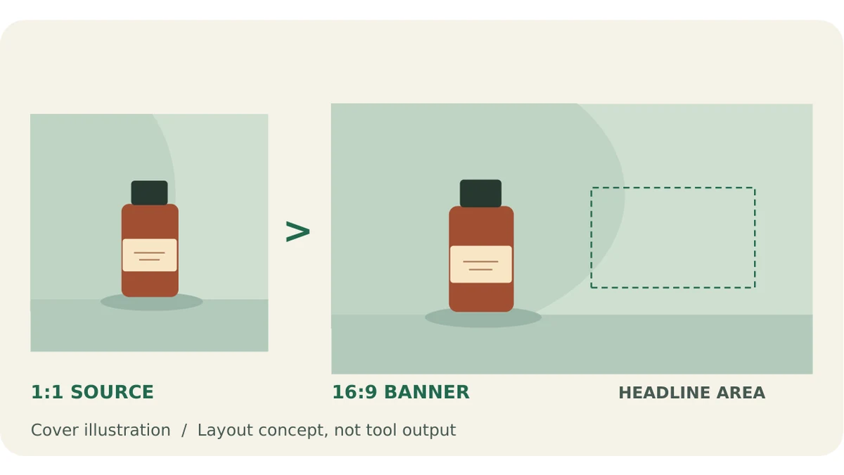
A square product photo can work beautifully in a catalog and still feel wrong in a wide hero banner. Crop too tightly and you lose the cap or the shadow that grounds the product. Stretch the photo and the package looks wider than it is. The better choice is to decide what needs to stay unchanged and what you can afford to add or remove.
If the product already fits inside a shallow horizontal strip, crop the photo. If the label, shape, or color must stay exactly as photographed, keep the original and add padding. If you want the scene to continue naturally beyond the photo edges, try AI expansion and check the result against the original.
For this walkthrough, start with one square product photo and keep a copy untouched. The goal is not just to fill a wide frame. It is to give the product enough breathing room, leave space for a headline, and still show buyers what they will actually receive.
Compare three layouts using the same photo
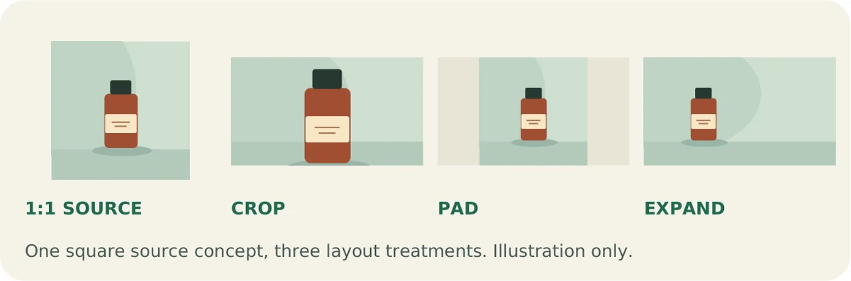
Open the same square photo in your image editor and make three versions at the same display size. Pick a 16:9 canvas, such as 1920 × 1080 pixels, so you can compare composition without a change in scale distracting you. That size is an example for your layout, not a promised export size from the AI tool.
Crop: trim what you can spare
A 16:9 crop made from a square photo normally cuts from the top and bottom. Move the crop window up or down instead of accepting the centered crop automatically. Keep the entire product and any shadow that helps it look grounded. If you can only make the crop work by cutting the packaging, pick another method.
Pad: keep the photo intact
Place the whole square photo on the wide canvas and fill the extra space on either side with a compatible color. You can place the square off-center to make a larger text area on one side. A visible edge between the photo and the padding can look intentional if you treat it like a panel rather than trying to disguise it.
Expand: continue the scene
AI expansion generates surroundings beyond the original photo. Try it when a countertop, studio backdrop, or wall would look more natural continuing across the banner than ending at a visible edge. The extra space can look convincing, but the model may also change details inside the source. Treat the result as a new image to review, not the untouched original on a wider canvas.
Expand a square photo to 16:9
1. Pick a clean square source
Use a sharp photo where the product is fully visible and well lit. Check the original logo and label at full size before uploading. If the product is already too close to an edge or its lettering is blurry, a wider frame won't make the source more reliable. Keep the original open so you can compare it with the new version.
2. Upload and choose 16:9
Open the AI Image Expander, upload your square photo, choose 16:9 under Aspect ratio, and select Generate. The tool documents JPG, PNG, or WebP uploads up to 5 MB. This workflow sets the shape of the image; it does not require a written prompt.
3. Compare the result before downloading
Check whether the floor, tabletop, or wall carries through where the original photo ends. Follow shadows and straight lines across that area; a sudden tilt or a repeated texture can make the edit obvious. Make sure the actual export is the shape you need. If your banner slot requires a specific pixel size, size the reviewed image to that canvas in your editor without stretching it.
4. Place the headline after expansion
Use the quieter side of the finished banner for text. If the product sits to the left, try the right; if the extension adds a busy texture there, use the other side or add a subtle solid panel. Set the headline as an editable text layer, not part of the generated picture. Preview it in its final placement, including on mobile if the layout changes there. Check that the headline doesn't overlap the product and that neither is clipped.
Check the product before you publish
Put the square source next to your finished banner. First compare the product itself, not the backgrounds. Zoom in on the spelling of the label, logo, cap, and outline. Look for missing letters, shifted colors, or a silhouette that has become wider or narrower. Then zoom out to banner size. A seam that is barely visible at full resolution can be obvious when it draws a line across the whole composition. Finally, check text contrast and whether the product is still easy to recognize at that size.
If the scene looks wrong but the product is accurate, try a simpler source photo or use padding with a background color sampled from the photo. If the product itself changes, don't publish that version as a product photo. Use the untouched square on a padded canvas instead. For a smoother transition, use the expanded image as a background only if you can place the original product image over it cleanly without distorting the product.
If you're deliberately changing the scene with written instructions, try Image to Image as a separate workflow. For example: “Extend the neutral studio backdrop to the right for headline space. Keep the bottle shape, packaging colors, and label unchanged.” Those instructions guide the edit; they don't guarantee that the product stays exact. Run the same checks before using the result.
For a banner where every label detail matters, padding is the dependable default. Choose expansion when the extra scene makes the layout stronger and the finished product still matches the original.